```{r}
#| output: false
library(ggplot2)
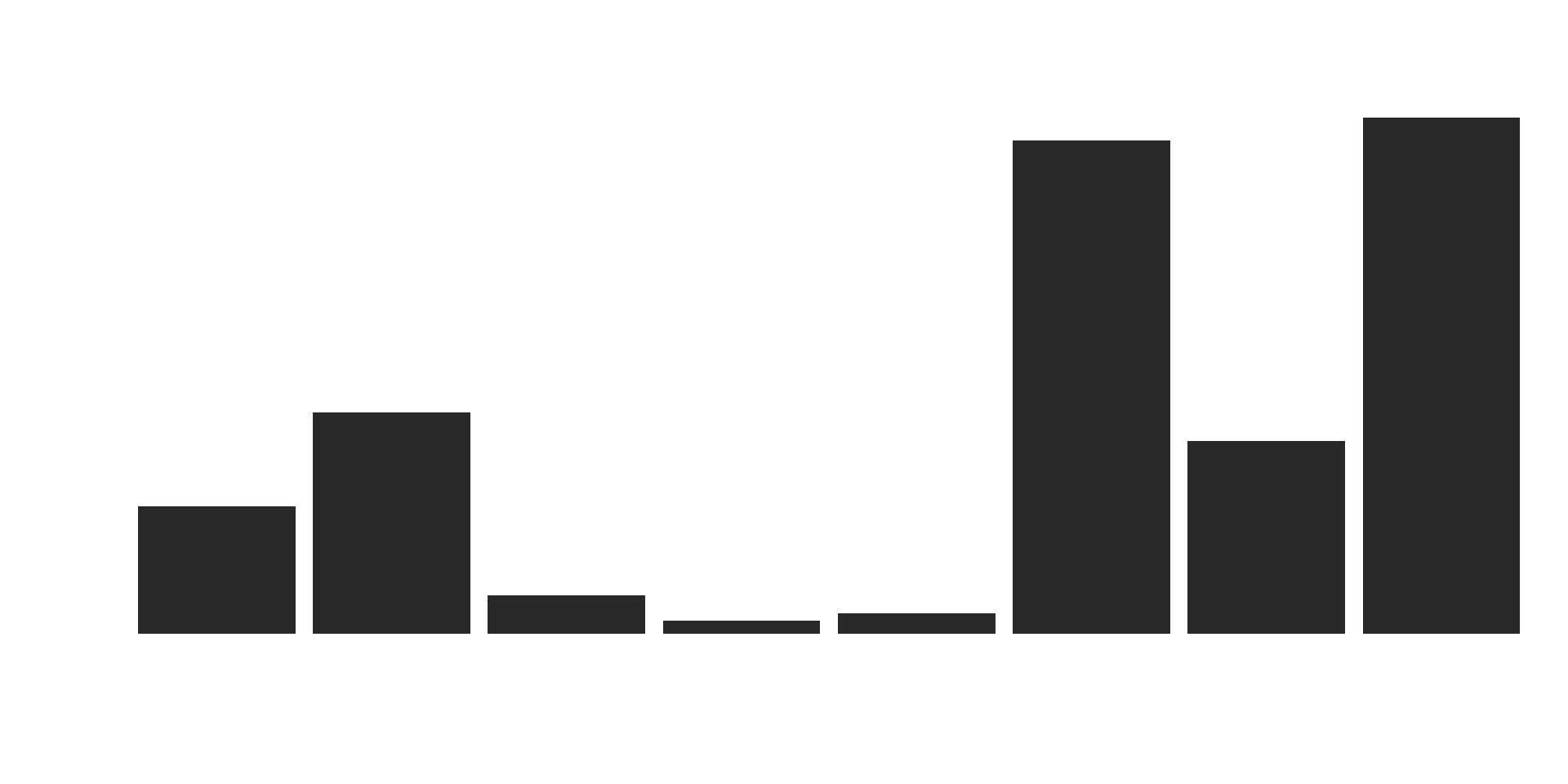
ggplot(aus_pops) +
aes(x = city, y = pop) +
geom_col(fill = "#222222ee") +
theme_minimal() +
theme(
plot.background = element_blank(),
panel.background = element_blank(),
panel.grid.major = element_blank(),
panel.grid.minor = element_blank(),
plot.title = element_text(colour = "white"),
axis.text = element_text(colour = "white"),
axis.title = element_text(colour = "white")) +
labs(title = "Population in millions")
```Your journey
from data science to animated web graphics
JAMES GOLDIE
DATA AND DIGITAL STORYTELLING LEAD, 360INFO
Hello!

I’m a data journalist at 360info
We deliver verified and reliable information to as many publishing, broadcasting and civic society outlets as possible
I lead our data efforts, publishing open graphics and datasets under Creative Commons
I also used to be a climate + health researcher!
Follow along today
Slides: https://positconf2024.talks.jamesgoldie.dev
Code: https://github.com/jimjam-slam/talk-positconf-aug2024
I’m in the Discord too!
Why I love Quarto
My career: research + data science -> communication -> data journalism
I’ve looked for tools to help bridge my existing technical skills
Quarto is a fantastic bridge
Today I want to bring you on this journey!
Wait, why is it a journey?
All of these have felt scary to me at some point:
Adding a(n S)CSS stylesheet to a Quarto or RMarkdown doc
Adding JavaScript to a Shiny app
Using D3.js to make a graphic
Build tools for JavaScript frameworks
But Quarto has everything you need to start learning!
First steps
Trying out OJS and Observable Plot
You can use OJS right now!
No need to download, add or configure anything
If you have Quarto, you’re ready to go! You can add OJS chunks to Quarto docs right now
Swap Observable Plot for ggplot2
Swap Observable Plot for ggplot2
Here’s our plot in R…
Swap Observable Plot for ggplot2
… and here it is in Observable Plot:
Getting data into OJS
How do we load our data in?
But why?
We can make more than just static plots!
Population in millions
Plot.plot({
marks: [
Plot.barY(transpose(aus_pops), {
x: "city",
y: "pop",
fill: "#222222ee",
ariaLabel: d => d.city + ": " + d.pop + " million people"
}),
Plot.tip(transpose(aus_pops), Plot.pointerX({
  x: "city",
  y: "pop",
  fill: "#333333",
  ariaHidden: true
})),
],
style: {
fontSize: 16
},
marginBottom: 45
})Levelling up
Simulating animation and conditional content
Animating a map
cities = [
  { name: "Brisbane",  lat: -27.467778, lon: 153.028056 },
  { name: "New Delhi", lat: 28.613889,  lon: 77.208889 },
  { name: "Singapore", lat: 1.283333,   lon: 103.833333 },
  { name: "Istanbul",  lat: 41.013611,  lon: 28.955 },
  { name: "Paris",     lat: 48.856667,  lon: 2.352222 },
  { name: "Nairobi",   lat: -1.286389,  lon: 36.817222 },
  { name: "São Paulo", lat: -23.55,     lon: -46.633333 },
  { name: "Montreal",  lat: 45.508889,  lon: -73.554167 },
  { name: "Houston",   lat: 29.762778,  lon: -95.383056 },
  { name: "Vancouver", lat: 49.260833,  lon: -123.113889 },
  { name: "Honolulu",  lat: 21.306944,  lom: -157.858333 }
]
cities = Array(11) [Object, Object, Object, Object, Object, Object, Object, Object, Object, Object, Object]
world = Object {type: "FeatureCollection", name: "naturalearth-land-110m", crs: Object, features: Array(127)}
Plot.plot({
  marks: [
    Plot.geo(world, {
      fill: "#222222"
    }),
    Plot.dot(cities, {
      x: "lon",
      y: "lat",
      fill: "#eb343d",
      stroke: "white",
      strokeWidth: 5,
      paintOrder: "stroke",
      size: 6
    }),
    Plot.text(cities, {
      x: d => d.lon + 2,
      y: d => d.lat + 2,
      text: "name",
      fill: "#eb343d",
      stroke: "white",
      strokeWidth: 5,
      paintOrder: "stroke",
      fontSize: 18,
      textAnchor: "start"
    }),
  ]
})Plot.plot({
marks: [
Plot.geo(world, {
fill: "#222222"
}),
Plot.dot(cities, {
x: "lon",
y: "lat",
fill: "#eb343d",
stroke: "white",
strokeWidth: 5,
paintOrder: "stroke",
size: 6
}),
Plot.text(cities, {
x: d => d.lon + 2,
y: d => d.lat + 2,
text: "name",
fill: "#eb343d",
stroke: "white",
strokeWidth: 5,
paintOrder: "stroke",
fontSize: 18,
textAnchor: "start"
}),
]
})What about a globe?
We can add a projection to make this a globe
Plot.plot({
  marks: [
    Plot.graticule(),
    Plot.sphere(),
    Plot.geo(world, {
      fill: "#222222"
    }),
    Plot.dot(cities, {
      x: "lon",
      y: "lat",
      fill: "#eb343d",
      stroke: "white",
      strokeWidth: 5,
      paintOrder: "stroke",
      size: 6
    }),
    Plot.text(cities, {
      x: d => d.lon + 2,
      y: d => d.lat + 2,
      text: "name",
      fill: "#eb343d",
      stroke: "white",
      strokeWidth: 5,
      paintOrder: "stroke",
      fontSize: 18,
      textAnchor: "start"
    }),
  ],
  projection: {
    type: "orthographic",
    rotate: [50, -10]
  }
})What about an animated globe?
OJS is reactive
If your plot includes something that changes, your plot will change too!
Let’s use this make an angle:
Then replace your plot’s rotation:
Plot.plot({
  marks: [
    Plot.graticule(),
    Plot.sphere(),
    Plot.geo(world, {
      fill: "#222222"
    }),
    Plot.dot(cities, {
      x: "lon",
      y: "lat",
      fill: "#eb343d",
      stroke: "white",
      strokeWidth: 5,
      paintOrder: "stroke",
      size: 6
    }),
    Plot.text(cities, {
      x: d => d.lon + 2,
      y: d => d.lat + 2,
      text: "name",
      fill: "#eb343d",
      stroke: "white",
      strokeWidth: 5,
      paintOrder: "stroke",
      fontSize: 18,
      textAnchor: "start"
    }),
  ],
  projection: {
    type: "orthographic",
    rotate: [angle, -10]
  }
})You can animate with scrolling too!
My colleague Andrew Bray presented Closeread yesterday
Closeread lets you make scrollytelling docs with Quarto!
You can use crProgress instead of now to animate on scroll
Conditional content
Sometimes it’s nice to show different things in different circumstances
You could use it for slides…
Here’s a simple timer:

… or mixed content!
selectedCities = Array(0) [columns: Array(2)]
selectedCities.length > 2 ?
  // NOTE - i've actually just inlined the plot since
  // it's using different data
  Plot.plot({
    marks: [
      Plot.barY(selectedCities, {
        x: "city",
        y: "pop",
        fill: "#222222ee",
        ariaLabel: d => d.city + ": " + d.pop + " million people"
      }),
      Plot.tip(transpose(aus_pops), Plot.pointerX({
        x: "city",
        y: "pop",
        fill: "#333333",
        ariaHidden: true
      })),
    ],
    style: {
      fontSize: 16
    },
    marginBottom: 45
  }) :
  md`╳ Not enough cities selected`
╳ Not enough cities selected
…or to make responsive graphics
Try resizing this window!
horizBarPlot = Plot.plot({
  marks: [
    Plot.barY(transpose(aus_pops), {
      x: "city",
      y: "pop",
      fill: "#222222ee",
      ariaLabel: d => d.city + ": " + d.pop + " million people"
    }),
    Plot.tip(transpose(aus_pops), Plot.pointerX({
      x: "city",
      y: "pop",
      fill: "#bbbbbb",
      ariaHidden: true
    })),
  ],
  style: {
    fontSize: 16
  },
  marginBottom: 45,
  height: 275,
  width: 1200
})
vertBarPlot = Plot.plot({
marks: [
Plot.barX(transpose(aus_pops), {
x: "pop",
y: "city",
fill: "#222222ee",
ariaLabel: d => d.city + ": " + d.pop + " million people"
}),
Plot.tip(transpose(aus_pops), Plot.pointerY({
x: "pop",
y: "city",
fill: "#bbbbbb",
ariaHidden: true
})),
],
style: {
fontSize: 32
},
marginLeft: 160,
marginBottom: 80,
height: 1000
})What are the limitations?
Most of the time, this is enough!
I can build interactives quickly and efficiently ✅
But I can’t transition from A to B easily.
In OJS, when you replace one thing with another, the first thing gets destroyed
I need something that is aware of the start and the finish
My wishlist
- OJS’s reactivity is lovely… but I want to bypass it sometimes
- I want to design graphics in the declarative way I do with ggplot2 and Observable Plot
- I want more control over what I draw
Sverto
Using Svelte in Quarto
Reactivity: everyone’s doing it
Reactivity is really popular these days! All of these are reactive:
| Category | Examples |
|---|---|
| Data | Shiny |
| App dev | SwiftUI (iOS), Jetpack Compose (Android) |
| Web dev | React, Svelte |
In all of these, you:
Pass data or options that might change
Tell it what you want to show
It takes care of the updates when things change
I particularly like Svelte
It has tools for turning data into changing graphics, like transitions
Reactivity
Declarative graphics: everyone’s doing them
Sound familiar?
This is philosophically similar to declarative graphics: we want to focus on what we want to draw, not getting bogged down in how to do it
Enter Sverto
These controls are OJS…
viewof selectedCity = Inputs.select(
  new Map([
    ["Melbourne", "086338"],
    ["Brisbane", "040842"]
  ]),
  {
    value: "086338"
  }
)

viewof selectedVariable = Inputs.select(
  new Map([
    ["Daytime", "tmax"],
    ["Nighttime", "tmin"]
  ]),
  {
    value: "tmax"
  }
)

viewof selectedSeason = Inputs.select(
  new Map([
    ["Whole year", 0],
    ["January", 1],
    ["February", 2],
    ["March", 3],
    ["April", 4],
    ["May", 5],
    ["June", 6],
    ["July", 7],
    ["August", 8],
    ["September", 9],
    ["October", 10],
    ["November", 11],
    ["December", 12]
  ]),
  {
    value: 0
  }
)

viewof selectedMetric = Inputs.select(
  new Map([
    ["Hottest", "max"],
    ["Average", "mean"],
    ["Coldest", "min"],
  ]),
  {
    value: "Average"
  }
)selectedCity = "086338"
selectedVariable = "tmax"
selectedSeason = 0
selectedMetric = "max"
… but this chart is Svelte!
(with just a smidge of D3.js)
import { aq, op } from "@uwdata/arquero"

fullCity = aq.loadCSV(
  "time-series/" + selectedVariable + "." + selectedCity + ".daily.csv")

tidiedCity = fullCity
  .rename(aq.names("date", "value"))
  .filter(d => d.date !== null)
  .params({ selectedSeason: selectedSeason })
  .derive({
    year: d => op.year(d.date),
    month: d => op.month(d.date) + 1
  })

// filter unless "Whole year" is selected
filteredCity = selectedSeason == 0 ?
  tidiedCity :
  tidiedCity.filter(d => d.month == selectedSeason)

// now group by year and calculate the metrics
allMetrics = filteredCity
  .groupby("year")
  .rollup({
    min:  d => op.min(d.value),
    mean: d => op.mean(d.value),
    max:  d => op.max(d.value),
  })

// finally, select the year and whichever metric column is chosen by the user
finalData = allMetrics
  .select("year", selectedMetric)
  .rename(aq.names("year", "value"))
import {aq as aq, op as op} from "@uwdata/arquero"
fullCity = Table: 4 cols x 41274 rows {_names: Array(4), _data: Object, _total: 41274, _nrows: 41274, _mask: null, _group: null, _order: null, _params: undefined, _index: null, _partitions: null}
tidiedCity = Table: 6 cols x 41273 rows (41274 backing) {_names: Array(6), _data: Object, _total: 41274, _nrows: 41273, _mask: n, _group: null, _order: null, _params: Object, _index: null, _partitions: null}
filteredCity = Table: 6 cols x 41273 rows (41274 backing) {_names: Array(6), _data: Object, _total: 41274, _nrows: 41273, _mask: n, _group: null, _order: null, _params: Object, _index: null, _partitions: null}
allMetrics = Table: 4 cols x 113 rows {_names: Array(4), _data: Object, _total: 113, _nrows: 113, _mask: null, _group: null, _order: null, _params: Object, _index: null, _partitions: null}
finalData = Table: 2 cols x 113 rows {_names: Array(2), _data: Object, _total: 113, _nrows: 113, _mask: null, _group: null, _order: null, _params: Object, _index: null, _partitions: null}
timeSeriesChart = new TimeSeriesChart.default({
  target: document.querySelector("#timeserieschart")
})
timeSeriesChart = Oi {$$: Object, $$set: ƒ(t)}
Array(113) [Object, Object, Object, Object, Object, Object, Object, Object, Object, Object, Object, Object, Object, Object, Object, Object, Object, Object, Object, Object, …]
The chart transitions smoothly whenever our OJS controls change!
What can Sverto do?
Sverto lets you write Svelte components, like charts and maps
Then import them into Quarto quickly and easily
And drive them with OJS reactivity
- Import the Svelte component
- Tell Sverto where to add it
Give it a try! https://sverto.jamesgoldie.dev
It’s dangerous to go alone
Take these!
Trying out OJS in Quarto?
Quarto docs
https://quarto.org/docs/interactive/ojs
Observable Plot docs
https://observablehq.com/plot
Observable Inputs docs
https://observablehq.com/documentation/inputs/overview
Levelling up with OJS?
360info’s OJS graphics
https://github.com/360-info
Observable’s examples
https://observablehq.com/explore#notebooks
Ready to use Svelte in Quarto?
Sverto
https://sverto.jamesgoldie.dev
Connor Rothschild: How to “Learn D3” in 2023
https://connorrothschild.github.io/v4/viz
Matthias Stahl: Svelte + D3 training
https://youtube.com/playlist?list=PLNvnDrMLMSipfbxSp1Z4v9Ydu2ud5i9V8&si=Fu326UCzouaMz3MM
Amelia Wattenberger: Fullstack D3 and Data Visualization
https://www.newline.co/fullstack-d3
Questions?
I’m in the Discord!
Thank you:
Posit for accepting my talk and Articulation for amazing speaker training
Andrew Bray for letting me pinch a Closeread example
Czepeku for letting me use their sweet backgrounds under licence
Bonus slides
What about D3.js?
Remember D3.js? We’ve used it before! Remember the scale functions?
D3 has lots of handy utilities, but it’s best known for tools that turn data into graphics:
D3 is lower level (ggplot2 users, think grid)
I failed to learn it for years!
D3’s “select” code is very imperative
As Connor Rothschild explains, you can use D3.js tools when it’s useful, but Svelte is often a better way to create graphics from data
What about D3.js?
The differences between D3 and Svelte are equivalent to the differences between instructions and authoring. In D3, we write instructions to tell JavaScript what to render; in Svelte, we write our output directly.
— Connor Rothschild, How to “Learn D3” in 2023
But web frameworks can be scary…
Most web frameworks have lovely browser sandboxes to try them out in…
But web frameworks can be scary…
But when you start a project for real, it gets confusing fast!
I designed Sverto with sensible defaults for Quarto users
Your journey from data science to animated web graphics JAMES GOLDIE DATA AND DIGITAL STORYTELLING LEAD, 360INFO